Widgets and Flutter tree structure.

One of the fundamental concepts of Flutter is that it is completely based on Widgets. This means that to create a container you must use a widget, to create a button you must use a widget, to create a simple text you must use a widget and so on.
Understanding widgets is much more important than starting to code your first Hello World for me, especially if you already have programming foundations from other languages. Let's see some examples of what I'm talking about.
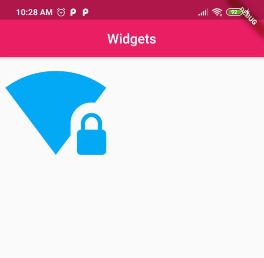
In Flutter, you can create an icon using the Icon widget.
Icon(Icons.wifi_lock, color: Colors.lightBlue, size: 150);As you can see this widget receives the constant of the icon, the color, the size and other things that we haven't placed for simplicity. Now if we want to create an icon that can be clicked to trigger an event we must use the IconButton widget.
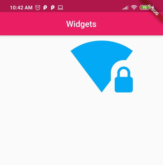
IconButton(
    icon: Icon(Icons.wifi_lock, color: Colors.lightBlue, size: 150),
    onPressed: (){},
);
Note that in this example the previous widget is used as a property of IconButton. That is, Icon is the value of the icon property of the IconButton widget. Either of the above examples would look like this on Android.
Now imagine that we want to give our icon widget some padding. If you know CSS, you will know that padding is the padding space of a container. In this case, as in all cases, we must use a widget, particularly the Padding widget.
Padding(
    padding: EdgeInsets.fromLTRB(170, 0, 0, 0),
    child: IconButton(
        icon: Icon(Icons.wifi_lock, color: Colors.lightBlue, size: 150),
        onPressed: (){}
    )
)
Notice that the result is as expected, with the fromLTRB method we have defined a left padding of 170.
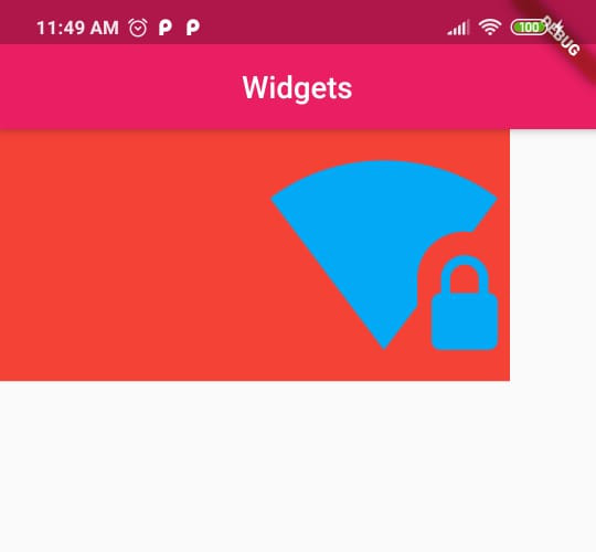
All of this leads us to an interesting concept which is the tree structure of the application. Generally, you'll have this structure as you'll need to chain widget after widget. Let's suppose now that we want to give a background to our widget. For this, we can use the Container widget which would be like an div element in HTML. That is, a generic element to which we will give a background color.
Container(
  color: Colors.red,
  child: Padding(
      padding: EdgeInsets.fromLTRB(170, 0, 0, 0),
      child: IconButton(
          icon: Icon(Icons.wifi_lock, color: Colors.lightBlue),
          onPressed: (){},
          iconSize: 150
      )
  ),
),
The result would be the following:
As your user interface becomes more complex, you will have a greater depth in the tree structure of the application. Also note that the way to pass parameters in the widgets is through key and value (key: value), where the key will almost always be child to chain widgets and the value will be the widget in question.